Footer options are located under Customize > 'Footer options' tab.
They control the look and feel of the footer section of the theme and are divided into 5 subtabs:
The Design tab provides styling options for the footer section. Here you can configure:
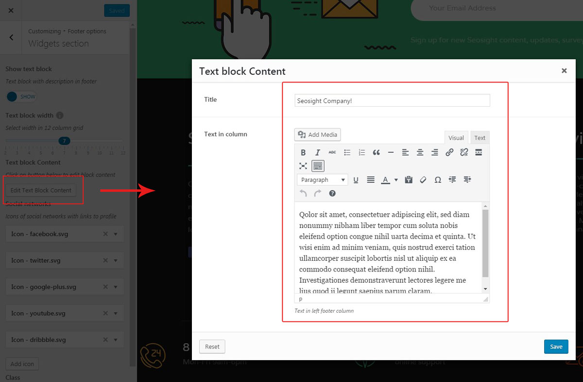
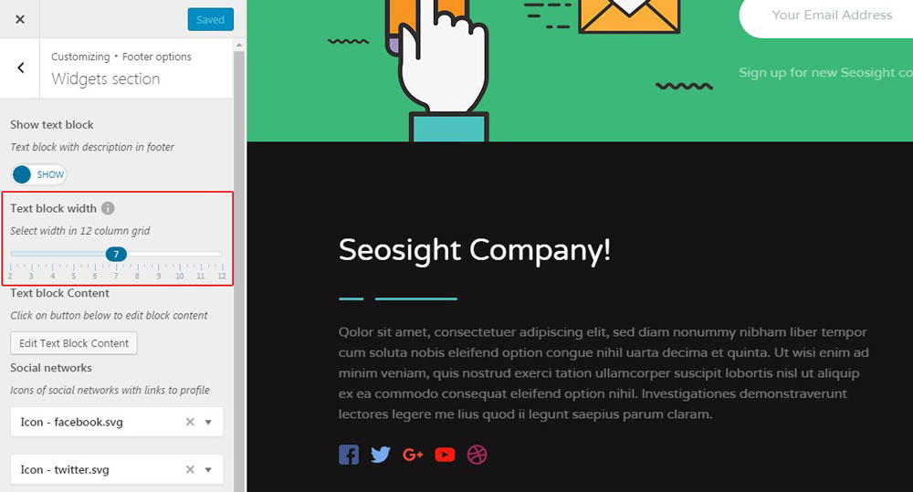
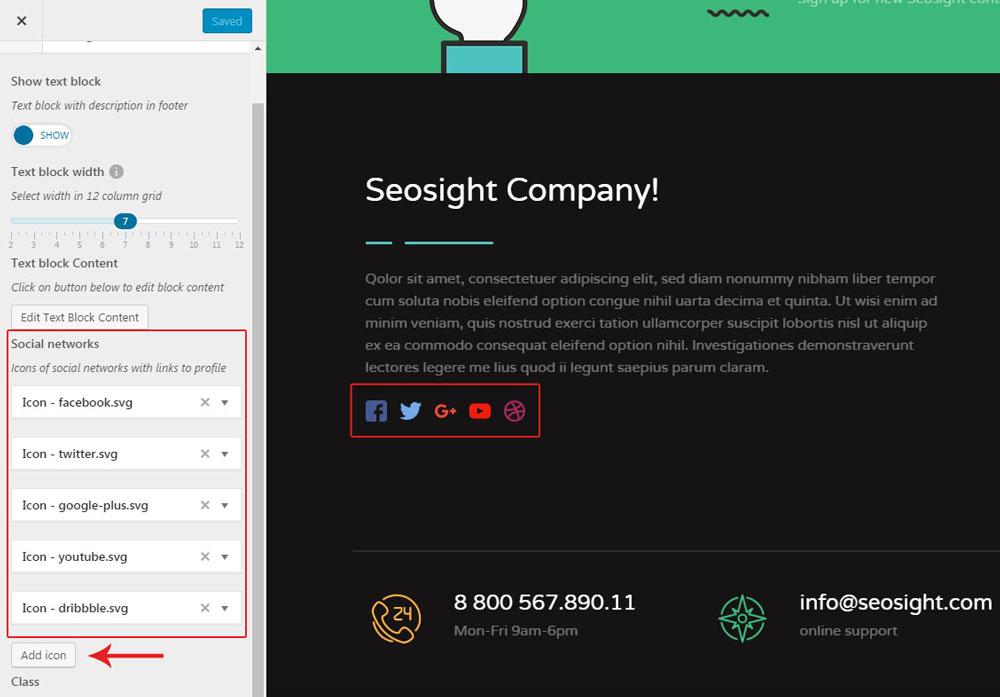
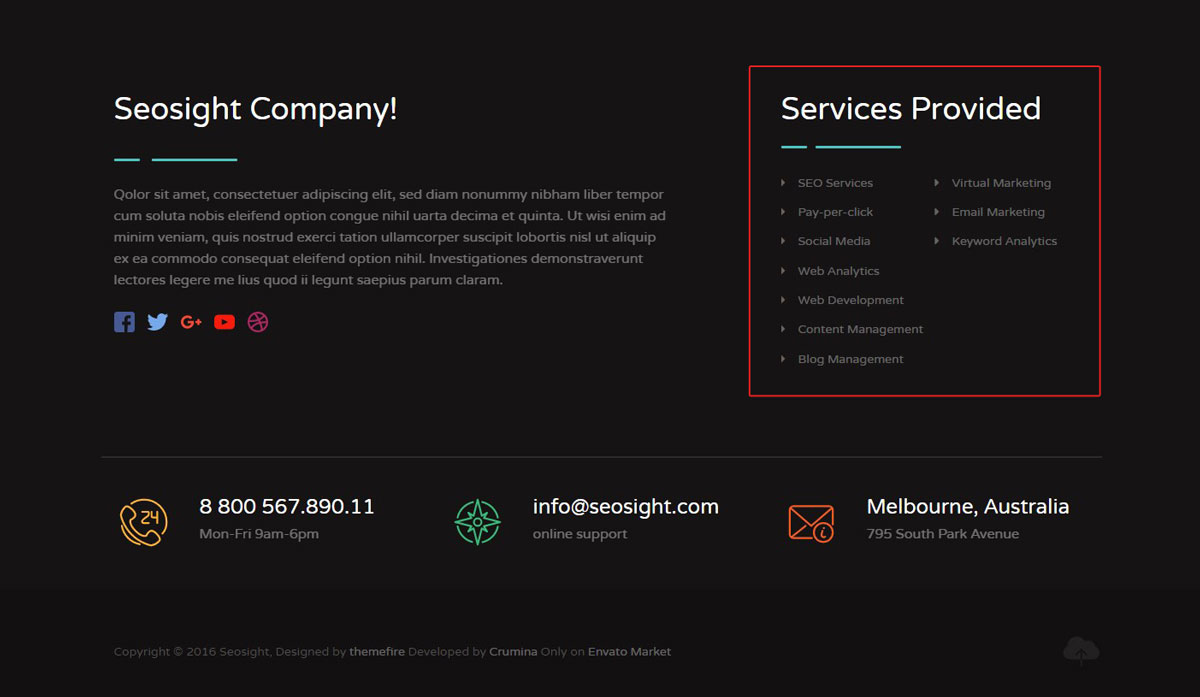
Under the 'Widgets section' tab, you can adjust the settings of the text block, that is displayed on the image below.
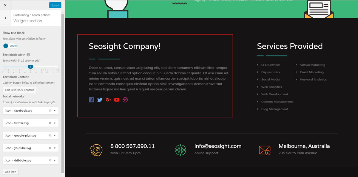
The provided options are as follows:
Under the 'Contacts section' tab, you can control contact information, like email address, phone number, and physical address. Simply click on the 'Add box' button and fill in the required fields. To remove the box, click on the 'cross' icon.
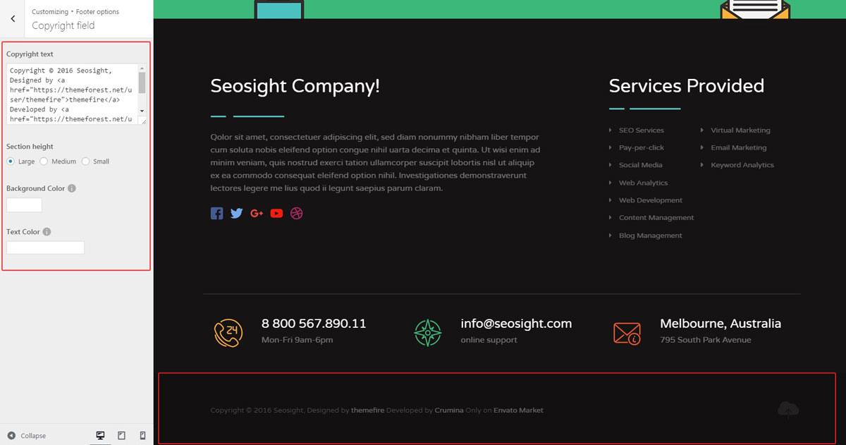
Copyright field options let you control the style of the copyright section. You can adjust:
Besides all the mentioned features above, you can add other widgets to the footer area. Widgets can be added via Appearance>Widgets>Footer widget area section.
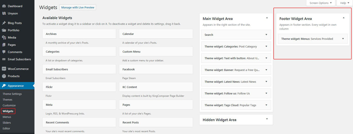
The widgets used in the footer in the Seosight demo page is called Theme Widget > Menus. It is displayed on the right-hand side of the Widgets section with custom text.
The position and size of the footer widget depend on the width of the left-hand text. It occupies 7-columns of the row in the demo site, which lets the menu widget stand beside it in the vacant 5 columns. If the left-hand text would occupy 12 columns, the menu widget would start the new row.
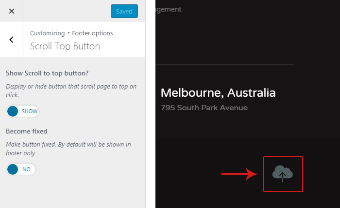
The scroll-to-top button can be customized under Customize > Footer options > 'Scroll Top Button' tab.
There are only 2 options:
 When you are ready, hit the 'Save & Publish' button.