Olympus HTML Social Network Toolkit is fully responsive template.
Responsive styles for resolutions <=768px were added in Olympus version 1.2., from May 8th, 2017.
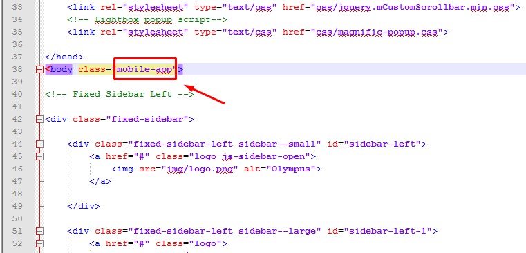
For realization of responsive mode design, there were added additional blocks of header, left and right side panels, that are displayed ONLY for resolutions <=768px. Their parent elements are as follows:
Header:
<header class="header header-responsive" id="site-header-responsive">...</div>
<div class="fixed-sidebar fixed-sidebar-responsive">...</div>
Right side panel
<div class="fixed-sidebar right fixed-sidebar-responsive">...</div>
We draw your attention to the fact, that standard header, left and right side panels are hidden (display: none) in responsive mode. The above mentioned components are displayed instead of them. The main page content stays unchanged, independently from the screen resolution on device you view them on.