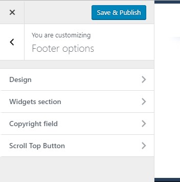
Footer options
Footer options are located under Customize > 'Footer options' tab.
They control look and feel of the footer section of the theme and are divided into 4 subtabs:
- Design
- Widget section
- Copyright field
- Scroll Top button
Design
Design tab provides styling options of the footer section. Here you can configure:
- Text color
- Titles and Links Color - color of widgets titles and links
- Background image - you can choose one of the predefined patterns or upload a custom image.
- Expand background - this option lets you stretch the image across the whole footer section. It is required if the uploaded image is smaller than the footer section, but you don't want it to get repeated.
- Fixed footer effect - makes the footer fixed.
- Background color - if you disable background image, background color will be displayed instead.
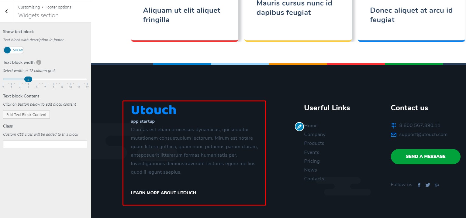
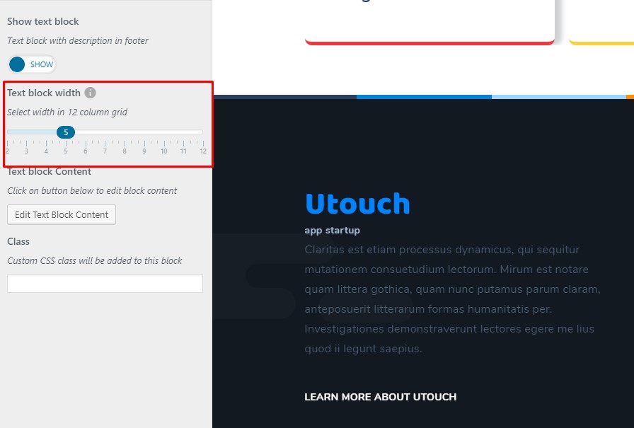
Under 'Widgets section' tab you can adjust settings of the text block, that is displayed on the image below.
The provided options are as follows:
- Show text block - you can enable or disable text block.
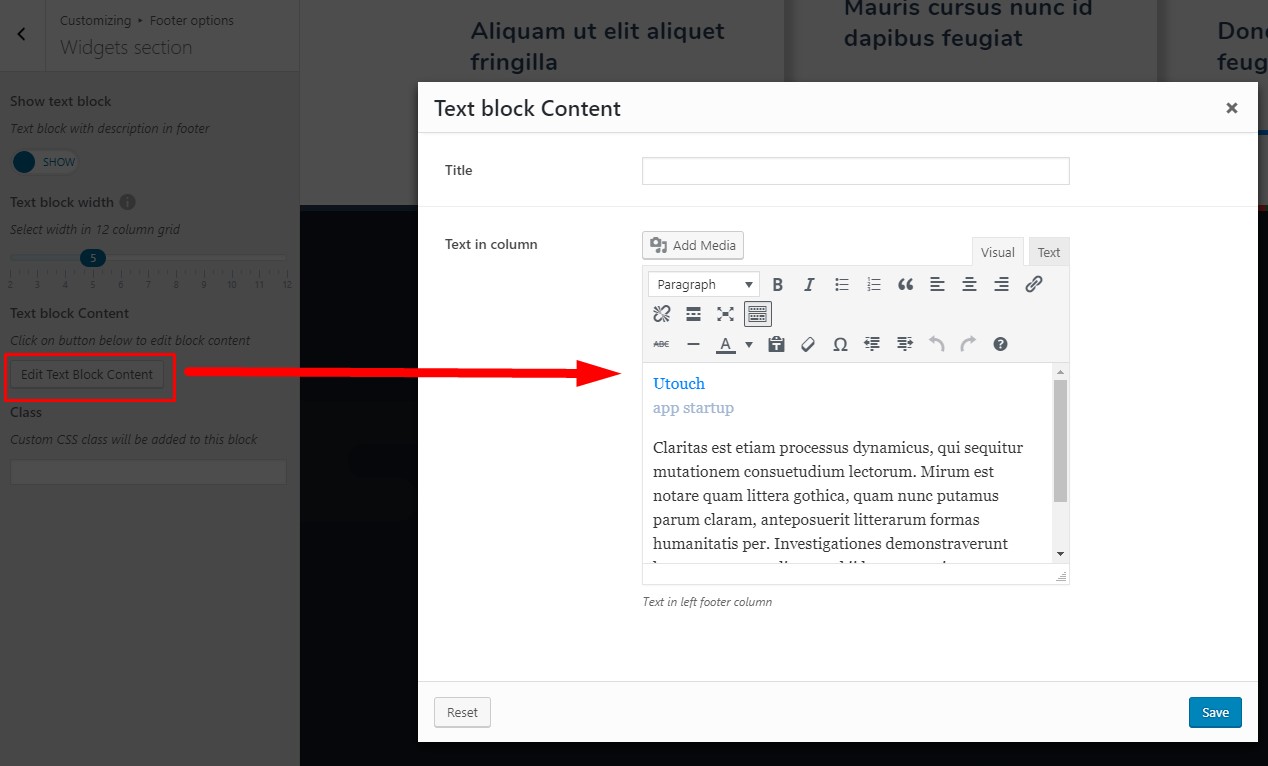
- Edit text block content - click on this button to open Text Block editor. Here you can enter title and text, that will be displayed in the text block.
- Text block width - you can control the width of the text block. The width is measured in grid columns.
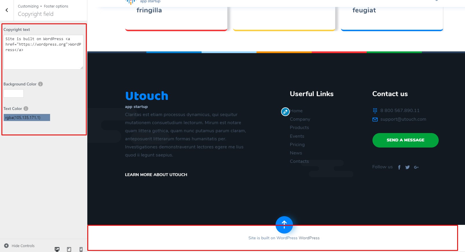
Copyright field
Copyright field options let you control style of the copyright section. You can adjust:
- Copyright text - enter custom text to the copyright section
- Background color
- Text color.
The scroll-to-top button can be customized under Customize > Footer options > 'Scroll Top Button' tab.
There are only 2 options:
- enable/disable the scroll-to-top button;
- make the button fixed.
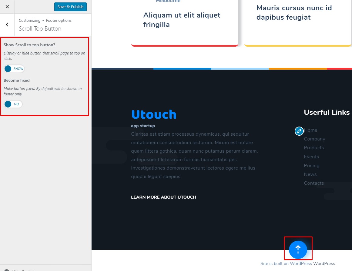
When you are ready, hit the 'Save & Publish' button.
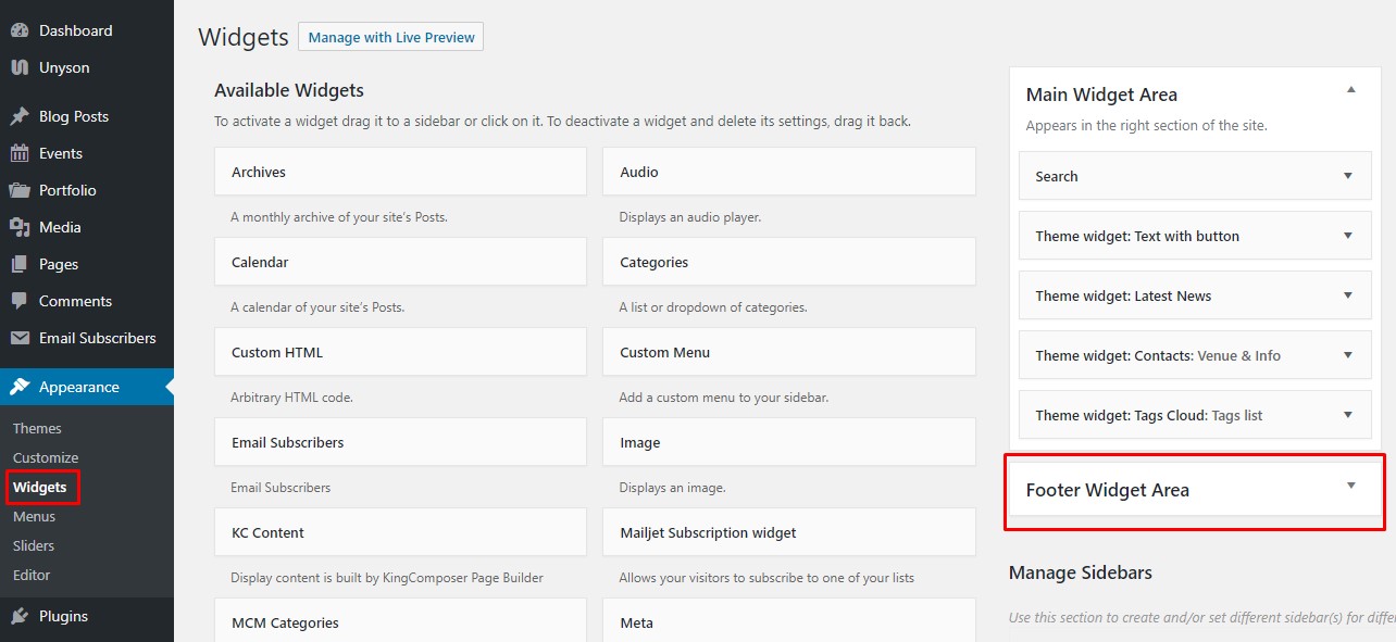
Adding widgets to footer section
Beside all above mentioned features, you can add other widgets to the footer area. Widgets can be added via Appearance>Widgets>Footer widget area section.